1.
This photo shows a head shot of a model with an ocean in the background. However that ocean is a piece of evaporation art that i took in the museum. I layered this over this background image to make it look as if he is imagining it from where he is standing. I left it in colour to emphasis the dull colour of the model and the bright colours coming though from the wallpaper brightening the photo up completely. The subject matter in this photo is both the male and the wallpaper, it has an anchor on the photo which draws the eye firstly to the model and then it is opened up onto the wallpaper and the glistening shine evolving out of the photograph. From the colour of the image being very dark it looks like i shot it in the dark and night, i like that effect of a person in the dark imagining being out in daylight. However, this was shot in a studio, using only soft-boxes. This photo looks slightly under exposed due to the photo being layered on top, however the photo of the model is correctly exposed.
I used a flash light, on the soft box to create shadows on the face, so on the right side of the face there is a shadow that was very good for the images i created on Photoshop on the next few pages. The reason for me creating this image was because i was very stumped for ideas so i went onto Photoshop and experimented with layering images and the different filters i could use and these were the turn outs to my image. I used an eye level portrait shot as i think it makes the image very personal and close, accentuating the meaning of the image. When taking this photo, it gave me a very calm feeling as it is very neutral, there is a sense of relief and happiness on his face which is liked. I didn't really have an idea for this image when i took it, i just took it and see what i could create with it, so i kept the face neutral and with this image over the top, it really fits in with the theme transformation with the two different thoughts blending together.
If i could change this image in any way it would be better if i lightened it up a bit, but with this photograph, it works really well, but i feel like there would be a better advantage the image. I would prefer it if more colours from the ocean picture would really catch the eye more as it would give a more positive vibe to the photo.
2.
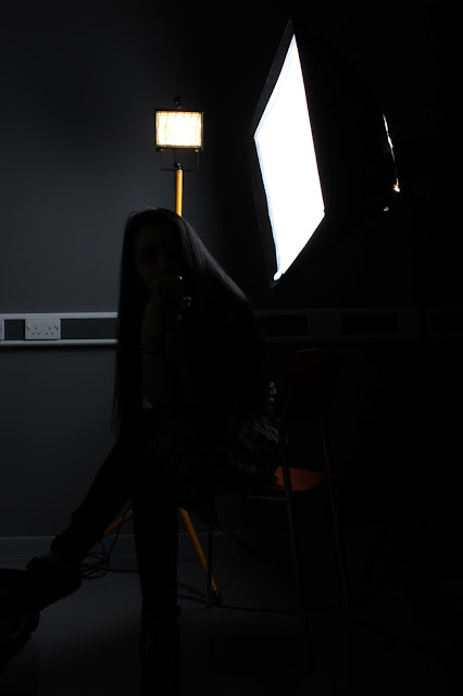
On this photo i used a flat soft box sheet and put a soft box angling away from the sheet, i got my model to stand in front and pose as if they are trying to escape, to give a shadow effect onto the screen which i captured. I really liked the mystery unknown feel the the image on its own, as you get a very negative vibe from the image, however it is very soft go it's very mixed towards its emotions. The lighting also adds to the feel of an unknown mystery, as it's a mixture of light and dark tones on each side of the image. This became very useful for when i inputted the torn painted image of Hudson Bay, The light tones adapted to the image however the dark tones rejected it leaving a silhouette of the person on the right. The wall layer gives the photo a very rustic dirty look which works really and that's why i like it, however it looks very simplistic in my opinion compared to all the other images, however to other people this may look very meaningful. Half of the image is a grey scale and the layered wall image is in full colour bring yellow/orange tones into the image, which can be a sense of freedom or fire, so it has a contrast between the two sides. I think it very successful in presenting the two different sides merging together and transforming the two sides into a contrast of emotions.
3.
This was another landscape image i took of my model from a side on as i felt you can fit more into an image on a landscape structure. I really like the cracking over lay on this image, as it gives the image a sense of pain, and makes him look as if he's breaking/falling apart.
Paige Crossland Photography
Thursday, 12 May 2016
Tuesday, 19 January 2016
Monday, 18 January 2016
Tuesday, 15 December 2015
Wednesday, 18 November 2015
Wednesday, 14 October 2015
Subscribe to:
Comments (Atom)


